
Plugin Guidelines

Here you will find guidelines for your plugin's metadata, iconography, usability, and vocabulary.

Following guidelines defined within this article ensures all Stream Deck plugins provide an inclusive, consistent, and good user-experience for Stream Deck users. Please check this page regularly as guidelines are subject to change.

Important

We, Elgato, reserve the right to request changes to your plugin in the event guideline requirements or recommendations are not followed. Failure to do so may result in your Marketplace submission being declined, or your plugin being removed from Marketplace.

Plugin

The guidelines within this section apply to your plugin, and include best practices for providing a high-quality user experience.

Naming

Your plugin's name is a word, or short phrase, that uniquely identifies your plugin and the functionality it provides.

Requirements

  • Do:

    use a unique name — check your name is available on Marketplace.

  • Do:accurately reflect the functionality provided by your plugin.
  • Don't:infringe copyright or trademarks.
  • Don't:use derogatory or offensive vocabulary

Recommendations

  • Recommended:descriptive and concise — for example "Volume Controller", "Screen Capture", "Color Picker", etc.
  • Recommended:memorable and easy to pronounce.
  • Not recommended:

    organization name — avoid including your organization name in your plugin's name; organization is already visible on Marketplace.

Author

The Author field uniquely identifies you, or your organization, as the creator of the plugin, and is visible within Marketplace and Stream Deck.

Requirements

  • Do:

    use match your Marketplace organization with the Author.

  • Do:use company name where applicable — for example "Elgato".
  • Do:use real name if you wish too — for example "Jane Doe".
  • Do:use online alias if you wish too — for example "jdodo".
  • Don't:infringe copyright or trademarks.
  • Don't:use derogatory or offensive vocabulary

UUIDs

Universally unique identifiers (UUIDs) are used by Stream Deck and Marketplace to identify:

Requirements

  • Do:

    include your author / organization, and plugin name, in your plugin UUID — for example com.elgato.volume-controller.

  • Do:

    prefix action UUIDs with your plugin UUID — for example com.elgato.volume-controller.mute-audio-device.

  • Don't:change UUIDs after publishing your plugin.

Recommendations

  • Recommended:

    reverse DNS format — consider using the format {DOMAIN}.{PRODUCT} for your plugin's UUID, for example com.elgato.wave-link.

  • Recommended:

    VisibleInActionsList — prefer cloning actions, and hiding older implementations if you wish to "change" action UUIDs.

UUIDs cannot change

UUIDs cannot be changed once a plugin has been published on Marketplace.

Icon

Your plugin's icon, visible within Stream Deck preferences pane, must adhere to the following guidelines.

Requirements

  • Do:use SVG or PNG format.
  • Do:accurately portray what your plugin does.
  • Don't:infringe copyright.
  • Don't:use offensive imagery.

    Sizing

    Plugin icon, 288 × 288 px — and 576 × 576 px when using rasterized images
    Supporting high DPI

    When using rasterized image files you must provide two sizes to support high DPI monitors. The high DPI image file must be named with an @2x suffix, for example, the image image.png must have a the high DPI variant named image@2x.png.

    Action List

    The guidelines within this section apply to the "Action List" within Stream Deck; found on the right-hand side, the action list provides a list of plugin's and their actions.

    Stream Deck with the action list highlighted

    Naming

    Your plugin's category and action names must accurately represent their functionality, and be sufficiently descriptive but concise (approximately 30 characters or less).

    Requirements

    • Do:specify the category.
    • Do:use the same, or similar, values for plugin name and category.
    • Don't:include author names in category, for example "Camera Controls (John Doe)".
    • Don't:use derogatory or offensive vocabulary.

    Recommendations

    • Recommended:specify action tooltips.
    • Recommended:"Volume Controller", "Mute Audio Device" — descriptive and concise names.
    • Recommended:"Twitch Mod Controls" — descriptive without infringing copyright exclusivity.
    • Not recommended:"Moderator Controls for Streaming" — too vague, and more than 30 characters.
    • Not recommended:"Toggle Chat Mode And Send Message" — should be two separate actions.
    • Not recommended:"Elgato Wave Link" — omit organization when also the author, prefer "Wave Link".
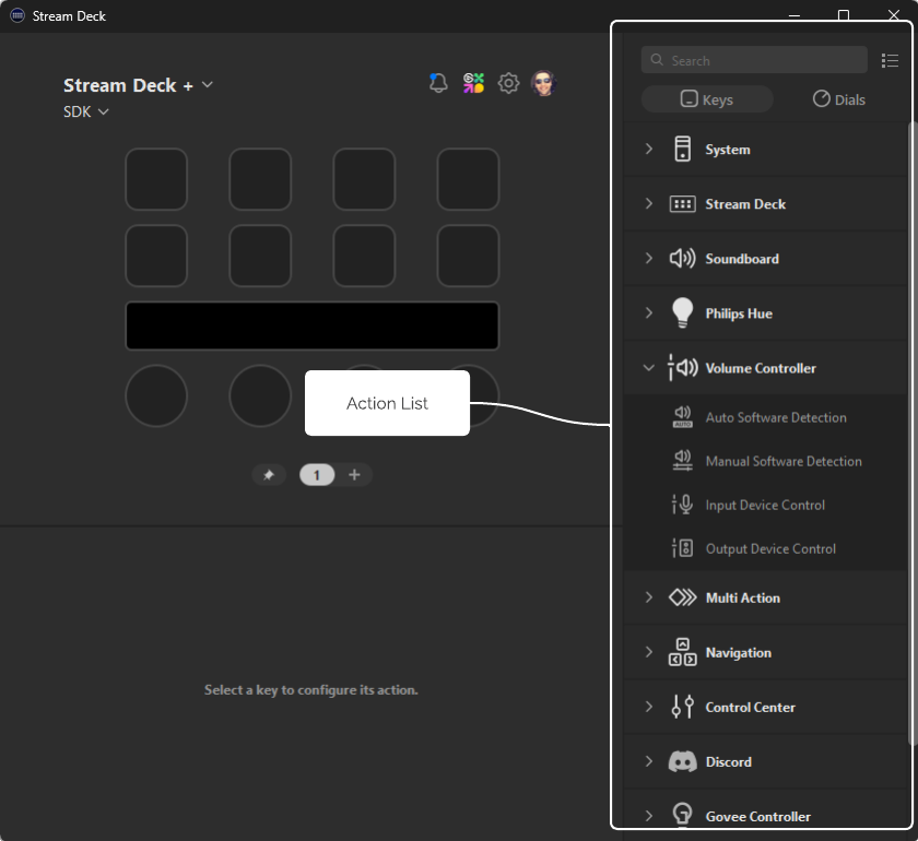
    Icons

    Category and action icons within the action list supports both vectorized (SVG) and rasterized (PNG) image files, with SVG being the recommended format to provide optimal scaling.

    Requirements

    • Do:use SVG or PNG format.
    • Do:use monochromatic color scheme, with a transparent background.
    • Do:

      use white stroke, #FFFFFF, for action list icons.

      Action list, category icon

      Good — Monochromatic category icon with white stroke

      Action list, action icon

      Good — Monochromatic action icon with white stroke; auto-adjusted by Stream Deck

    • Do:provide high-DPI variants when using rasterized images (PNG).
    • Don't:

      use colors to style action list icons.

      Action list icon with color

      Bad — Action lists icons with color

    • Don't:

      use solid backgrounds on action list icons.

      Action list icon with solid background

      Bad — Action list icons with a solid background

    Recommendations

    • Recommended:SVG — scale well on all devices and layouts.
    • Not recommended:PNG — rasterized images may not scale well.

    Sizing

    Category icon example

    Category icon, 28 × 28 px — and 46 × 46 px when using rasterized images

    Action icon example

    Action icon, 20 × 20 px — and 40 × 40 px when using rasterized images

    Supporting high DPI

    When using rasterized image files you must provide two sizes to support high DPI monitors. The high DPI image file must be named with an @2x suffix, for example, the image image.png must have a the high DPI variant named image@2x.png.

    Grouping

    When determining the actions provided by your plugin, you should aim to provide an array of functionality that adds value to your plugin, without overwhelming the user.

    Recommendations

    • Recommended:

      combine actions — actions with common settings should be consolidated, and have a property inspector for configuring them.

      Consolidated actions

      Good — Consolidate actions that share settings

    • Recommended:provide a reasonable amount of functionality, between 2 and 30 actions, no more.
    • Not recommended:

      avoid static actions that aren't configurable.

      Static actions

      Bad — Avoid static actions

    If you find your plugin has lots of actions, more than 30, it is recommended to create multiple smaller plugin(s). Doing so can improve discoverability within Marketplace. For example:

    BeforeActionAfter
    "System" pluginMute Device"Audio Controls" plugin
    Set Volume
    Shut Down"System Controls" plugin
    Sleep
    Lock Screen
    Set Primary Monitor"Monitor Manager" plugin
    Change Resolution
    Rotate Monitor

    Keys & Dials

    The guidelines within this section apply to the keys and dials found on the Stream Deck canvas, and best practices for providing visual feedback to the user.

    Key Icons

    Key icons, represented as state images within the manifest, can be vectorized (SVG) or rasterized (PNG) images, with SVG being the recommended format to provide optimal scaling.

    In addition to static images, animated (GIF) images may also be specified within the manifest, but cannot be used when programmatically updating actions.

    Requirements

    • Do:use SVG, PNG, or GIF format.
    • Do:

      use states effectively — update icons when a state associated with the action changes, for example the associated smart light is turned on / off.

    Recommendations

    • Recommended:

      SVG — vectorized images allow you to provide visually appealing dynamic keys, for example charts and meters.

    • Recommended:

      positional awareness — consider grouping actions based on their coordinates to provide new levels of interactions.

      Good — Volume Controller's action act as an interactive slider when actions are paired together.

    • Not recommended:

      programmatic flooding — keys are not intended to rendering high frame rate videos; limit programmatic calls to a maximum of 10 per second.

    Sizing

    Key icon, 77 × 77 px — and 144 × 144 px when using rasterized images

    Supporting high DPI

    When using rasterized image files you must provide two sizes to support high DPI monitors. The high DPI image file must be named with an @2x suffix, for example, the image image.png must have a the high DPI variant named image@2x.png.

    Updating programmatically

    When updating key icons programmatically only one image size can be supplied. For rasterized images, it is recommended to provide an image that uses the higher DPI dimensions; Stream Deck will scale the image down accordingly.

    Layouts

    Touch strip layouts found on Stream Deck + support providing rich feedback in the form of elements, and allow for touch and hold interaction. The following should be considered when using layouts.

    Requirements

    • Do:

      use accessible touch size — interactive elements should be accessible, and have a touch size of at least 35 × 35 px.

    Recommendations

    • Recommended:

      built-in layouts — where suitable, consider using pre-defined layouts.

    • Recommended:partial updates — utilize elements effectively to update portions of layouts.
    • Recommended:responsive — elements should update promptly when the state associated with the action changes.
    • Not recommended:

      lots of touchable elements — space on the touch strip is limited, and cramped elements can be difficult for users with accessibility requirements.

    • Not recommended:

      programmatic flooding — touch strips are not intended to rendering high frame rate videos; limit programmatic calls to a maximum of 10 per second.

    Sizing

    Touch strip layout, 200 × 100 px

    Layout boundary

    All elements within a layout must be within the bounds of the layout; if an element exceeds the bounds, the layout will fail to load.

    Feedback

    Stream Deck SDK enables your plugin to provide feedback to the user when an action (or operation) succeeds or fails.

    Requirements

    • Do:

      use showAlert to inform the user when an action was unsuccessful. Also applicable to dials.

    Recommendations

    • Recommended:

      use showOk to inform the user of success when there is no visual indicator, for example a file was written or request was sent.

    • Not recommended:

      duplicate success indicators — for actions that have visual indication of success, for example a light changing and the action's state updating, showOk is unnecessary.

    Logging

    Use logging to record information, specifically when issues occur, to assist with diagnosing potential problems.

    Property Inspector (UI)

    Property inspectors within your plugin play an integral role in allowing users to configure and customize your plugin's actions. Property inspectors must adhere to the following.

    Requirements

    • Do:use checkbox for boolean settings.
    • Do:use select or radio for single-select settings.
    • Do:provide validation feedback.
    • Do:automatically save settings on change.
    • Do:provide setup help — where necessary, provide links to support pages.
    • Don't:

      include donation or sponsor links — prefer "Additional Links" in your product's page on Marketplace.

    • Don't:list copyright — prefer description, or "Additional Links", in your product's page on Marketplace
    • Don't:have a "Save" button for action settings.

    Recommendations

    • Recommended:

      hidden by default — to prevent flickering, when using a single property inspector file, hide components by default, and show only necessary components on DOM ready.

    • Not recommended:

      complex configuration — avoid using "lots" of components; prefer splitting the action into smaller actions if necessary.

    • Not recommended:large paragraphs — space is limited, and should be reserved for configuration.

    Vocabulary

    The following guidelines outline how to correctly word products, functionality, and features, associated with Elgato and Stream Deck, when providing copy for your plugins.

    Branding

    • Do:use "Elgato"
    • Do:use "Stream Deck" — two words.
    • Do:use "Stream Deck +" — plus symbol.
    • Do:use "Stream Deck Mobile"
    • Do:use "Marketplace" — one word.
    • Do:use "Maker Console".
    • Don't:use "ElGato" — must use lowercase g.
    • Don't:use "El gato" — cats not included.
    • Don't:use "StreamDeck" — must include space.
    • Don't:use "Stream Deck+" — must include space after "Deck".
    • Don't:use "Stream Deck Plus" — must use +.

    Features

    • Do:use "key" — when referring to physical Stream Deck buttons, including Stream Deck Mobile.
    • Do:use "dial" — when referring to physical Stream Deck dials.
    • Do:use "touch strip" — when referring to the physical Stream Deck + touch strip.
    • Don't:use "touchscreen".

    Miscellaneous

    • Do:use "plugin" — hyphen should be omitted.
    • Recommended:"App" — prefer instead of "application".

    Design Resources

    Below is a collection of design resources to assist with producing high-quality assets for your plugin.

    licensing

    When including open-source resources in your plugin, you must ensure all license requirements, outlined by the project, are adhered to.

    Elgato Icons

    Elgato Icons View Elgato icons

    Google Material Symbols

    Google Material Symbols View Google Material Symbols (license)

    Bootstrap Icons

    Bootstrap Icons View Bootstrap icons (license)