Dials & Touch Strip
Dial actions are a combination of two parts of Stream Deck, the dial itself and a portion of the touch strip.
What is an Encoder?
The dial and portion of the touch strip that make up a dial action are collectively known as an "Encoder". Combined, they allow for your plugin to receive dial and touch events, as well as provide feedback on the touch strip in the form of layouts.
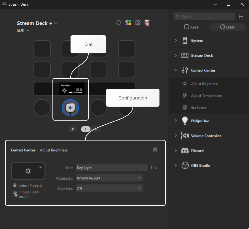
Layouts
Layouts are used to draw information about your actions on the touch display. Stream deck has a few built-in layouts, but you can also build your own custom layouts using JSON files included in your plugin folder. Layouts are composed of layout items that can be updated programmatically.
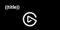
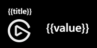
Built-in Layouts
There are several built-in layouts available when rendering information on the Stream Deck + touch strip.
- Icon ($X1)
- Canvas ($A0)
- Value ($A1)
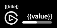
- Indicator ($B1)
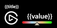
- Gradient indicator ($B2)
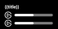
- Double indicator ($C1)
{
    "$schema": "https://schemas.elgato.com/streamdeck/plugins/layout.json",
    "id": "$X1",
    "items": [
        {
            "key": "title",
            "type": "text",
            "rect": [16, 10, 136, 24],
            "font": { "size": 16, "weight": 600 },
            "alignment": "left"
        },
        {
            "key": "icon",
            "type": "pixmap",
            "rect": [76, 40, 48, 48]
        }
    ]
}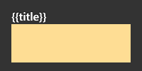
Note: The canvas is denoted in yellow, and the full-canvas in gray.
{
    "$schema": "https://schemas.elgato.com/streamdeck/plugins/layout.json",
    "id": "$A0",
    "items": [
        {
            "key": "full-canvas",
            "type": "pixmap",
            "rect": [0, 0, 200, 100]
        },
        {
            "key": "title",
            "type": "text",
            "rect": [16, 10, 136, 24],
            "zOrder": 1,
            "font": { "size": 16, "weight": 600 },
            "alignment": "left"
        },
        {
            "key": "canvas",
            "type": "pixmap",
            "rect": [16, 34, 136, 54],
            "zOrder": 1
        }
    ]
}
{
    "$schema": "https://schemas.elgato.com/streamdeck/plugins/layout.json",
    "id": "$A1",
    "items": [
        {
            "key": "title",
            "type": "text",
            "rect": [16, 10, 136, 24],
            "font": { "size": 16, "weight": 600 },
            "alignment": "left"
        },
        {
            "key": "icon",
            "type": "pixmap",
            "rect": [16, 40, 48, 48]
        },
        {
            "key": "value",
            "type": "text",
            "rect": [76, 40, 108, 32],
            "font": { "size": 24, "weight": 600 },
            "alignment": "right"
        }
    ]
}
{
    "$schema": "https://schemas.elgato.com/streamdeck/plugins/layout.json",
    "id": "$B1",
    "items": [
        {
            "key": "title",
            "type": "text",
            "rect": [16, 10, 136, 24],
            "font": { "size": 16, "weight": 600 },
            "alignment": "left"
        },
        {
            "key": "icon",
            "type": "pixmap",
            "rect": [16, 40, 48, 48]
        },
        {
            "key": "value",
            "type": "text",
            "rect": [76, 40, 108, 32],
            "font": { "size": 24, "weight": 600 },
            "alignment": "right"
        },
        {
            "key": "indicator",
            "type": "bar",
            "rect": [76, 74, 108, 12],
            "value": 0,
            "subtype": 4,
            "border_w": 0
        }
    ]
}
{
    "$schema": "https://schemas.elgato.com/streamdeck/plugins/layout.json",
    "id": "$B2",
    "items": [
        {
            "key": "title",
            "type": "text",
            "rect": [16, 10, 136, 24],
            "font": { "size": 16, "weight": 600 },
            "alignment": "left"
        },
        {
            "key": "icon",
            "type": "pixmap",
            "rect": [16, 40, 48, 48]
        },
        {
            "key": "value",
            "type": "text",
            "rect": [76, 40, 108, 32],
            "font": { "size": 24, "weight": 600 },
            "alignment": "right"
        },
        {
            "key": "indicator",
            "type": "gbar",
            "rect": [76, 74, 108, 20],
            "value": 0,
            "subtype": 4,
            "bar_h": 12,
            "border_w": 0,
            "bar_bg_c": "0:#ff0000,0.33:#a6d4ec,0.66:#f4b675,1:#00ff00"
        }
    ]
}
{
    "$schema": "https://schemas.elgato.com/streamdeck/plugins/layout.json",
    "id": "$C1",
    "items": [
        {
            "key": "title",
            "type": "text",
            "rect": [16, 10, 136, 24],
            "font": { "size": 16, "weight": 600 },
            "alignment": "left"
        },
        {
            "key": "icon1",
            "type": "pixmap",
            "rect": [16, 40, 24, 24]
        },
        {
            "key": "icon2",
            "type": "pixmap",
            "rect": [16, 68, 24, 24]
        },
        {
            "key": "indicator1",
            "type": "bar",
            "rect": [48, 46, 136, 12],
            "value": 0,
            "subtype": 4,
            "border_w": 0
        },
        {
            "key": "indicator2",
            "type": "bar",
            "rect": [48, 74, 136, 12],
            "value": 0,
            "subtype": 4,
            "border_w": 0
        }
    ]
}
Manifest
Built-in layouts can be used as an action's default layout by setting the Actions[].Encoder.layout property within the manifest. For example:
{
    "$schema": "https://schemas.elgato.com/streamdeck/plugins/manifest.json",
    "Actions": [
        {
            "Icon": "action-icon",
            "Name": "Action One",
            "Controllers": ["Encoder"],

            "Encoder": {
                "layout": "$B1"
            },
            "States": [
                {
                    "Image": "state-image"
                }
            ],
            "UUID": "come.elgato.test.one"
        }
    ],
    "Author": "Elgato",
    "Software": {
        "MinimumVersion": "6.6"
    }
    // ...
}
Programmatically
Built-in layouts can also be assigned to an instance of an action programmatically using the setFeedbackLayout function, for example:
import { action, SingletonAction, WillAppearEvent } from "@elgato/streamdeck";

@action({ UUID: "com.elgato.test.one" })
export class IncrementCounter extends SingletonAction {
	/**
	 * Occurs when the action will appear.
	 */
	override onWillAppear(ev: WillAppearEvent): Promise<void> {
		if (ev.action.isDial()) {
			return ev.action.setFeedbackLayout("$B1");
		}
	}
}
Custom Layouts
Custom layouts are composed of layout items provided in a JSON file located in the *.sdPlugin folder.
Layouts have a canvas size of 200 × 100 px. If items fall outside of these bounds, Stream Deck will not render the layout.
Manifest
Custom layouts can be used as an action's default layout by setting the Actions[].Encoder.layout property within the manifest. For example:
{
    "$schema": "https://schemas.elgato.com/streamdeck/plugins/manifest.json",
    "Actions": [
        {
            "Icon": "action-icon",
            "Name": "Action One",
            "Controllers": ["Encoder"],

            "Encoder": {
                "layout": "custom-layout.json"
            },
            "States": [
                {
                    "Image": "state-image"
                }
            ],
            "UUID": "come.elgato.test.one"
        }
    ],
    "Author": "Elgato",
    "Software": {
        "MinimumVersion": "6.6"
    }
    // ...
}
Programmatically
Custom layouts can also be assigned to an instance of an action programmatically using the setFeedbackLayout function, for example:
import { action, SingletonAction, WillAppearEvent } from "@elgato/streamdeck";

@action({ UUID: "com.elgato.test.one" })
export class IncrementCounter extends SingletonAction {
	/**
	 * Occurs when the action will appear.
	 */
	override onWillAppear(ev: WillAppearEvent): Promise<void> {
		if (ev.action.isDial()) {
			return ev.action.setFeedbackLayout("custom-layout.json");
		}
	}
}
Debugging
You can debug your custom layouts using the CLI tool's validate command.
streamdeck validateFor example, here is a layout in which the item would render outside the canvas.
{
    "$schema": "https://schemas.elgato.com/streamdeck/plugins/layout.json",
    "id": "hello-world",
    "items": [
        {
            "key": "title",
            "type": "text",

            "rect": [100, 0, 136, 50], // x (100) + width (136) exceeds 200
            "font": { "size": 32, "weight": 600 },
            "alignment": "left"
        }
    ]
}
The CLI tool would provide the following output:
8:13  error    items[0].rect[0] must not be outside of the canvas
8:13 error └ Width and height, relative to the x and y, must be within the 200x100 px canvasIf a layout item is anticipated to render outside of the given bounds, Stream Deck will not render the layout and instead provide details in Stream Deck app logs.
Updating Layouts
You can update the values in a layout programmatically using the setFeedback function, by referencing layout items by their key. You can directly update the value of the item or set specific properties of the item. Properties not included in the payload will remain unchanged.
import { action, DialUpEvent, SingletonAction } from "@elgato/streamdeck";
@action({ UUID: "com.elgato.layout-image-test.increment" })
export class IncrementCounter extends SingletonAction<CounterSettings> {
/**
* Occurs when the user releases a dial.
*/
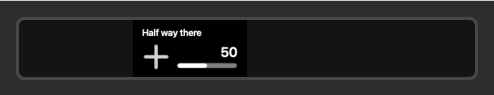
override onDialUp(ev: DialUpEvent<CounterSettings>): Promise<void> | void {
ev.action.setFeedback({
title: "Half way there",
});
}
}
/**
* Settings for {@link IncrementCounter}.
*/
type CounterSettings = {
count?: number;
incrementBy?: number;
};import { action, DialUpEvent, SingletonAction } from "@elgato/streamdeck";
@action({ UUID: "com.elgato.layout-image-test.increment" })
export class IncrementCounter extends SingletonAction<CounterSettings> {
/**
* Occurs when the user releases a dial.
*/
override onDialUp(ev: DialUpEvent<CounterSettings>): Promise<void> | void {
ev.action.setFeedback({
indicator: {
value: 50,
},
});
}
}
/**
* Settings for {@link IncrementCounter}.
*/
type CounterSettings = {
count?: number;
incrementBy?: number;
};
Reserved Layout Item Keys
Layouts utilize the key value of an item to identify said item, however there are a few reserved keys that can be overridden by the user.
title- As with key actions, users can set a custom title for dial/touch strip actions, which will take precedence over the plugin provided title.icon- As with key actions, users can set a custom icon for dial/touch strip actions, which will take precedence over the plugin provided icon.
Trigger Descriptions
Trigger descriptions can help the user to understand what the encoder does in a particular dial action. This can be set in the manifest file using the Actions[].Encoder.TriggerDescriptions property.
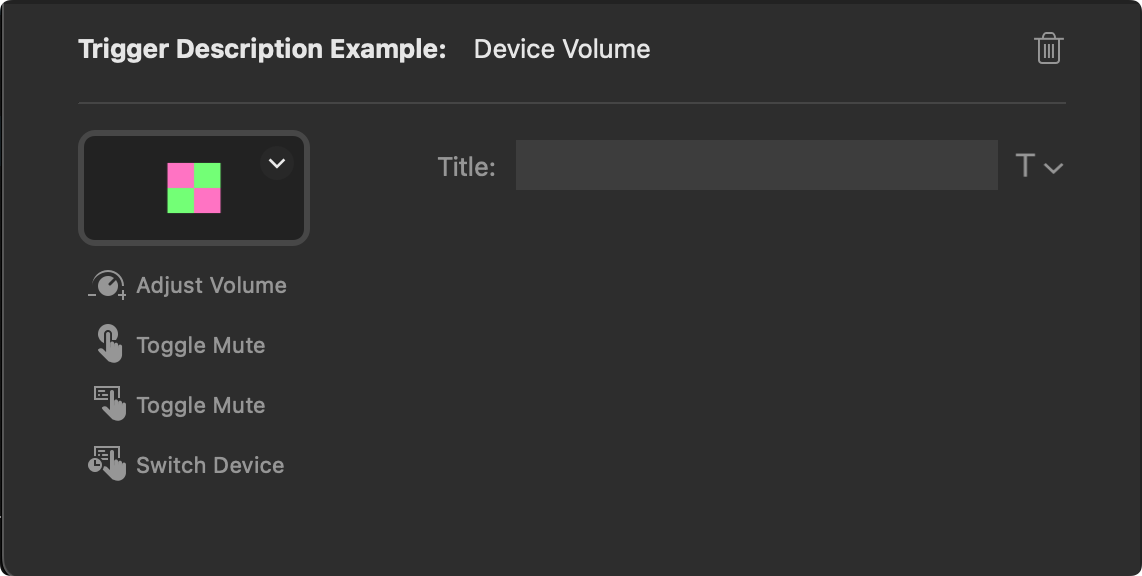
{
    "Actions": [
        {
            "Icon": "action-icon",
            "Name": "Trigger Description Example",
            "Controllers": ["Encoder"],
            "Encoder": {
                "layout": "$A1",

                "TriggerDescription": {
                    "Push": "Play / Pause",
                    "Rotate": "Adjust Volume",
                    "Touch": "Play / Pause",
                    "LongTouch": "Skip Track"
                }
            }
        }
    ]
    // ...
}
Update Trigger Descriptions
You can programmatically update the trigger descriptions using the setTriggerDescription function.
import { action, DialUpEvent, SingletonAction } from "@elgato/streamdeck";

@action({ UUID: "com.elgato.trigger-description-example.increment" })
export class IncrementCounter extends SingletonAction<CounterSettings> {
	/**
	 * Occurs when the user releases a dial.
	 */
	override onDialUp(ev: DialUpEvent<CounterSettings>): Promise<void> | void {

		ev.action.setTriggerDescription({
			push: "Increment counter",
			rotate: "Adjust increment",
			touch: "Increment counter",
			longTouch: "Reset counter",
		});
	}
}

/**
 * Settings for {@link IncrementCounter}.
 */
type CounterSettings = {
	count?: number;
	incrementBy?: number;
};
Events
In addition to the action events found on both keys and dials, dials also receive the following events in the form of overridable methods on the SingletonAction class.
onDialDown
Occurs when the user presses a dial (Stream Deck +). See also SingletonAction.onDialUp.
NB: For other action types see SingletonAction.onKeyDown.
function onDialDown?(ev: DialDownEvent): void | Promise<void>Parameters
ev: DialDownEventRequired
Information about the event, including the source action and contextual payload information.
onDialRotate
Occurs when the user rotates a dial (Stream Deck +).
function onDialRotate?(ev: DialRotateEvent): void | Promise<void>Parameters
ev: DialRotateEventRequired
Information about the event, including the source action and contextual payload information.
onDialUp
Occurs when the user releases a pressed dial (Stream Deck +). See also SingletonAction.onDialDown.
NB: For other action types see SingletonAction.onKeyUp.
function onDialUp?(ev: DialUpEvent): void | Promise<void>Parameters
ev: DialUpEventRequired
Information about the event, including the source action and contextual payload information.
onTouchTap
Occurs when the user taps the touchscreen (Stream Deck +).
function onTouchTap?(ev: TouchTapEvent): void | Promise<void>Parameters
ev: TouchTapEventRequired
Information about the event, including the source action and contextual payload information.
Commands
The following commands are available to dial actions.
Some events are applicable to both dials and keys, such as onWillAppear. To invoke a dial-only command within these event handlers, you need to first assert the action is a dial using Action.isDial().
getResources
Gets the resources (files) associated with this action; these resources are embedded into the action when it is exported, either individually, or as part of a profile.
Available from Stream Deck 7.1.
function getResources(): Promise<Resources>getSettings
Gets the settings associated this action instance.
function getSettings<U extends JsonObject>(): Promise<U>setFeedback
Sets the feedback for the current layout associated with this action instance, allowing for the visual items to be updated. Layouts are a powerful way to provide dynamic information
to users, and can be assigned in the manifest, or dynamically via Action.setFeedbackLayout.
The feedback payload defines which items within the layout will be updated, and are identified by their property name (defined as the key in the layout's definition).
The values can either by a complete new definition, a string for layout item types of text and pixmap, or a number for layout item types of bar and gbar.
function setFeedback(feedback: FeedbackPayload): Promise<void>Parameters
feedback: FeedbackPayloadRequired
Object containing information about the layout items to be updated.
setFeedbackLayout
Sets the layout associated with this action instance. The layout must be either a built-in layout identifier, or path to a local layout JSON file within the plugin's folder.
Use in conjunction with Action.setFeedback to update the layout's current items' settings.
function setFeedbackLayout(layout: string): Promise<void>Parameters
layout: stringRequired
Name of a pre-defined layout, or relative path to a custom one.
setImage
Sets the image to be display for this action instance within Stream Deck app.
NB: The image can only be set by the plugin when the the user has not specified a custom image.
function setImage(image?: string): Promise<void>Parameters
image: string
Image to display; this can be either a path to a local file within the plugin's folder, a base64 encoded string with the mime type declared (e.g. PNG, JPEG, etc.),
or an SVG string. When undefined, the image from the manifest will be used.
setResources
Sets the resources (files) associated with this action; these resources are embedded into the action when it is exported, either individually, or as part of a profile.
Available from Stream Deck 7.1.
function setResources(resources: Resources): Promise<void>Parameters
resources: ResourcesRequired
The resources as a map of file paths.
setSettings
Sets the settings associated with this action instance. Use in conjunction with Action.getSettings.
function setSettings<U extends JsonObject>(value: U): Promise<void>Parameters
value: URequired
Settings to persist.
setTitle
Sets the title displayed for this action instance.
NB: The title can only be set by the plugin when the the user has not specified a custom title.
function setTitle(title: string): Promise<void>Parameters
title: stringRequired
Title to display.
setTriggerDescription
Sets the trigger (interaction) descriptions associated with this action instance. Descriptions are shown within the Stream Deck application, and informs the user what
will happen when they interact with the action, e.g. rotate, touch, etc. When descriptions is undefined, the descriptions will be reset to the values provided as part
of the manifest.
NB: Applies to encoders (dials / touchscreens) found on Stream Deck + devices.
function setTriggerDescription(descriptions?: TriggerDescriptionOptions): Promise<void>Parameters
descriptions: TriggerDescriptionOptions
Descriptions that detail the action's interaction.
showAlert
Temporarily shows an alert (i.e. warning), in the form of an exclamation mark in a yellow triangle, on this action instance. Used to provide visual feedback when an action failed.
function showAlert(): Promise<void>